Personal Portfolio using html and css.
This is one of the project of responsive web desing course on freecodecamp.org. The design of the project if provided by freecodecamp.org itself.
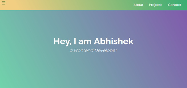
Now here's the working demo of the project https://abhishek-singh77.github.io/SimplePortfolio/ and the repository is https://github.com/abhishek-singh77/SimplePortfolio
Now I've not used any external images all the images are from the internet and i've provided the link of all the websites in this project.
Let's begin
HTML
<!DOCTYPE html>
<!--[if lt IE 7]> <html class="no-js lt-ie9 lt-ie8 lt-ie7"> <![endif]-->
<!--[if IE 7]> <html class="no-js lt-ie9 lt-ie8"> <![endif]-->
<!--[if IE 8]> <html class="no-js lt-ie9"> <![endif]-->
<!--[if gt IE 8]> <html class="no-js"> <![endif]-->
<html>
<head>
<meta charset="utf-8">
<meta http-equiv="X-UA-Compatible" content="IE=edge">
<title></title>
<meta name="description" content="">
<meta name="viewport" content="width=device-width, initial-scale=1">
<link rel="stylesheet" href="style.css">
<link rel="stylesheet" href="https://use.fontawesome.com/releases/v5.8.2/css/all.css"
integrity="sha384-oS3vJWv+0UjzBfQzYUhtDYW+Pj2yciDJxpsK1OYPAYjqT085Qq/1cq5FLXAZQ7Ay"
crossorigin="anonymous" />
<link href="https://fonts.googleapis.com/css?family=Poppins:200i,300,400&display=swap"
rel="stylesheet"/>
<link href="https://fonts.googleapis.com/css?family=Raleway:700&display=swap"
rel="stylesheet" />
</head>
<body>
<header>
<nav id="navbar" class="nav">
<ul class="nav-list">
<li>
<a href="#welcome-section">About</a>
</li>
<li>
<a href="#projects">Projects</a>
</li>
<li>
<a href="#contact">Contact</a>
</li>
</ul>
</nav>
</header>
<section id="welcome-section" class="welcome-section">
<h1>Hey, I am XYZ</h1>
<p>a Frontend Developer</p>
</section>
<main>
<section id="projects" class="projects-section">
<h2 class="projects-section-header">Here's my work:</h2>
<div class="projects-grid">
<a href="https://codepen.io/freeCodeCamp/full/zNqgVx" target="_blank" class="project project-tile">
<img Class="project-image" src="https://cdn.freecodecamp.org/testable-projects-fcc/images/tribute.jpg" alt="project"/>
<p class="project-title">
<span class="code"><</span>
Tribute Page
<span class="code">/></span>
</p>
</a>
<a href="https://codepen.io/freeCodeCamp/full/qRZeGZ" target="_blank" class="project project-tile" >
<img class="project-image" src="https://cdn.freecodecamp.org/testable-projects-fcc/images/random-quote-machine.png" alt="project" />
<p class="project-title">
<span class="code"><</span>
Random Quote Machine
<span class="code">/></span>
</p>
</a>
<a href="https://codepen.io/freeCodeCamp/full/wgGVVX" target="_blank" class="project project-tile" >
<img class="project-image" src="https://cdn.freecodecamp.org/testable-projects-fcc/images/calc.png" alt="project" />
<p class="project-title">
<span class="code"><</span>
JavaScript Calculator
<span class="code">/></span>
</p>
</a>
<a
href="https://codepen.io/freeCodeCamp/full/wGqEga"
target="_blank"
class="project project-tile"
>
<img
class="project-image"
src="https://cdn.freecodecamp.org/testable-projects-fcc/images/wiki.png"
alt="project"
/>
<p class="project-title">
<span class="code"><</span>
Wikipedia Viewer
<span class="code">/></span>
</p>
</a>
<a
href="https://codepen.io/freeCodeCamp/full/KzXQgy"
target="_blank"
class="project project-tile"
>
<img
class="project-image"
src="https://cdn.freecodecamp.org/testable-projects-fcc/images/tic-tac-toe.png"
alt="project"
/>
<p class="project-title">
<span class="code"><</span>
Tic Tac Toe Game
<span class="code">/></span>
</p>
</a>
</div>
<a href="https://codepen.io/FreeCodeCamp/" class="btn btn-show-all" target="_blank">
Show all<i class="fas fa-chevron-right"></i>
</a>
</section>
</main>
<section id="contact" class="contact-section">
<div class="contact-section-header">
<h2>Let's work together...</h2>
<p>How do you take your coffee?</p>
</div>
<div class="contact-links">
<a href="https://facebook.com/freecodecamp" target="_blank" class="btn contact-details">
<i class="fab fa-facebook-square"></i> Facebook</a>
<a id="profile-link" href="https://github.com/freecodecamp" target="_blank" class="btn contact-details">
<i class="fab fa-github"></i> GitHub</a>
<a href="https://twitter.com/freecodecamp" target="_blank"class="btn contact-details" >
<a href="mailto:example@example.com" class="btn contact-details">
<i class="fas fa-at"></i> Send a mail</a>
<a href="tel:555-555-5555" class="btn contact-details">
<i class="fas fa-mobile-alt"></i> Call me</a>
</div>
</section>
<footer>
<p>
A sample personal porfolio page as per the instruction of FCC for responsive web design projects.
</p>
<p>
© Created for
<a href="https://www.freecodecamp.com/" target="_blank"
>freeCodeCamp <i class="fab fa-free-code-camp"></i
></a>
</p>
</footer>
<script src="" async defer></script>
</body>
</html>
In above code I've maid three sections dividing the Header, Body, and Footer. And in each section I've followed the provided layout like, in Header I've created a navigation bar for proper traversal of the user into different section as well as the pages if any.
Similarly, the body contains the list of projects, and contact information along with the social media handles, you can add your cv their as well that will look great too.
Now all you need to do is complete the CSS and then modify the pages as per your need.
CSS :
* {
margin: 0;
padding: 0;
}
*,*::before,*::after { box-sizing: inherit; }
html {
box-sizing: border-box;
font-size: 62.5%;
scroll-behavior: smooth;
}
@media (max-width: 75em) { /* 1200px / 16px = 75em */
html {
font-size: 60%;
}
}
@media (max-width: 61.25em) { /* 980px / 16px = 61.25em */
html {
font-size: 58%;
}
}
@media (max-width: 28.75em) { /* 460px / 16px = 28.75em */
html {
font-size: 55%;
}
}
/* Base styles */
body {
font-family: 'Poppins', sans-serif;
font-size: 1.8rem; /* 18px */
font-weight: 400;
line-height: 1.4;
color: rgb(255, 255, 255);
}
h1,
h2 {
font-family: 'Raleway', sans-serif;
font-weight: 700;
text-align: center;
}
h1 {
font-size: 6rem;
}
h2 {
font-size: 4.2rem;
}
ul {
list-style: none;
}
a {
text-decoration: none;
color: rgb(255, 255, 255);
}
img {
display: block;
width: 100%;
}
/* nav */
.nav {
display: flex;
justify-content: flex-end;
position: fixed;
top: 0;
left: 0;
width: 100%;
background: linear-gradient(62deg, #f1ce82 10%, #38ad73 100%);
box-shadow: 0 2px 0 rgba(22, 194, 151, 0.822);
z-index: 10;
}
.nav-list {
display: flex;
margin-right: 2rem;
}
@media (max-width: 28.75em) {
.nav {
justify-content: center;
}
.nav-list {
margin: 0 1rem;
}
}
.nav-list a {
display: block;
font-size: 2.2rem;
padding: 2rem;
}
.nav-list a:hover {
background: var(--main-blue);
}
/* Welcome section */
.welcome-section {
display: flex;
flex-direction: column;
justify-content: center;
align-items: center;
width: 100%;
height: 100vh;
background-color: rgba(22, 194, 151, 0.822);
background-image: linear-gradient(62deg, #70d4ab 0%, #8157ac 100%);
}
.welcome-section > p {
font-size: 3rem;
font-weight: 200;
font-style: italic;
color: var(--main-red);
}
/* Projects section */
.projects-section {
text-align: center;
padding: 10rem 2rem;
background: rgb(131, 119, 199);
}
.projects-section-header {
max-width: 640px;
margin: 0 auto 6rem auto;
border-bottom: 0.2rem solid rgb(255, 255, 255);
}
@media (max-width: 28.75em) {
.projects-section-header {
font-size: 4rem;
}
}
/* "Automagic" image grid using no media queries */
.projects-grid {
display: grid;
grid-template-columns: repeat(auto-fit, minmax(320px, 1fr));
grid-gap: 4rem;
width: 100%;
max-width: 1280px;
margin: 0 auto;
margin-bottom: 6rem;
}
@media (max-width: 30.625em) {
.projects-section {
padding: 6rem 1rem;
}
.projects-grid {
grid-template-columns: 1fr;
}
}
.project {
background: rgb(236, 187, 123);
box-shadow: 1px 1px 2px rgba(0, 0, 0, 0.5);
border-radius: 2px;
}
.code {
color: rgba(22, 194, 151, 0.822);
transition: color 0.3s ease-out;
}
.project:hover .code {
color: #ff7f50;
}
.project-image {
height: calc(100% - 6.8rem);
width: 100%;
object-fit: cover;
}
.project-title {
font-size: 2rem;
padding: 2rem 0.5rem;
}
.btn {
display: inline-block;
padding: 1rem 2rem;
border-radius: 2px;
}
.btn-show-all {
font-size: 2rem;
background: rgba(22, 194, 151, 0.822);
transition: background 0.3s ease-out;
}
.btn-show-all:hover {
background: rgb(236, 187, 123);
}
.btn-show-all:hover > i {
transform: translateX(2px);
}
.btn-show-all > i {
margin-left: 10px;
transform: translateX(0);
transition: transform 0.3s ease-out;
}
/* Contact section */
.contact-section {
display: flex;
flex-direction: column;
justify-content: center;
align-items: center;
text-align: center;
width: 100%;
height: 80vh;
padding: 0 2rem;
background: rgba(22, 194, 151, 0.822);
}
.contact-section-header > h2 {
font-size: 6rem;
}
@media (max-width: 28.75em) {
.contact-section-header > h2 {
font-size: 4rem;
}
}
.contact-section-header > p {
font-style: italic;
}
.contact-links {
display: flex;
justify-content: center;
width: 100%;
max-width: 980px;
margin-top: 4rem;
flex-wrap: wrap;
}
.contact-details {
font-size: 2.4rem;
text-shadow: 2px 2px 1px #1f1f1f;
transition: transform 0.3s ease-out;
}
.contact-details:hover {
transform: translateY(8px);
}
/* Footer */
footer {
font-weight: 300;
display: flex;
justify-content: space-evenly;
padding: 2rem;
background: rgba(22, 194, 151, 0.822);
border-top: 4px solid rgb(236, 187, 123);
}
footer > p {
margin: 2rem;
}
footer i {
vertical-align: middle;
}
@media (max-width: 28.75em) {
footer {
flex-direction: column;
text-align: center;
}
}


0 Comments